
If one word can capture the essence of the creative process, I would argue that it would be: colour. Some of my earliest and most vivid childhood memories are intimately tied with colours.
It was the cerulean blue sky which airplanes flew into when my grandfather took me to the airport — not to travel — but just for the sheer joy of seeing these steel birds fly towards unknown destinations. It was the bright yellow, red and green oil paint squeezed from countless tubes that my father used, as I was growing up, to create his latest paintings. It was the sense of adventure which I still get from remembering the red colour of the new 1982 family car.
Colours are associated with feelings, smells, memories and even aspirations.
Capturing colour trends
As storytellers, designers, and marketers, colour plays a big role in how we communicate. How the target audience we try to reach, and connect with, perceives our message — as accented by brand-specific colours — has a major impact on their purchasing decisions.
Colour influences our choices in fashion, home furnishings, which restaurants we choose to go to based on the occasion, and so much more.
The influence of colour in a myriad of industries such as design, travel, fashion and technology is so central that trendsetting industry leaders publish annual "Colours of the Year" selections. These announcements are often highly anticipated and foreshadow important trends.
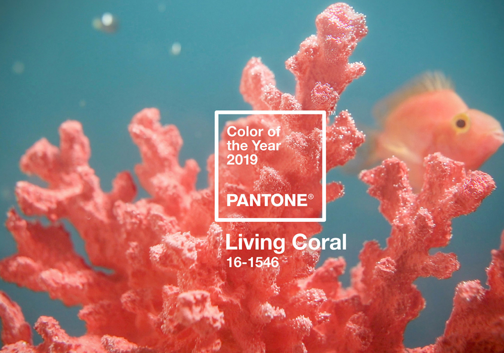
A great example is the much-anticipated annual Color of the Year announcement by Pantone — the company behind the industry-standard Pantone Matching System (PMS) colour space. In December 2018, Pantone released the 2019 colour of the year: PANTONE 16-1546 Living Coral.
As demonstrated in the two videos below, their decision had an immediate impact on trends in fashion, make-up choices and much more. A Twitter search of the #LivingCoral and #ColorOfTheYear hashtags will yield a myriad of results across industries.
What a gig
Recently, I had the fantastic opportunity to use my copywriting skills to help describe and announce the ‘ColorDirection 2020’ published last month by Milliken & Company — a leading South Carolina-based chemical company founded in 1865. Their stated vision is to combine their scientific, technical and creative insights to enhance the things that people use, enjoy and encounter in their normal daily lives.
The ColorDirection 2020 report from Milliken identifies six colour tones, under the theme of Connected Comfort, reflecting "the personal experiences capturing the connection color creates between products from various markets and the consumers they serve."
After receiving some detailed background about the creative thought process followed by Milliken, I approached the crafting of the recently published press release, and social media, for the ColorDirection 2020 report by exploring the "colours of the human journey."
It was nice to see the press release being picked up by chemical industry publications and I'm looking forward to seeing how the six colour tones selected for ColorDirection 2020 make their way into inspiring the work of industrial designers working on new technologies, consumer products, materials and textures.
Capturing the right tone
Since these "colour of the year" publications aim to identify current trends and provide a creative and strategic direction for designers the world over to follow, it's easy to see how hitting the mark 100% of the time is difficult.
Pantone's 2019 colour of the year certainly had its fair share of detractors. PANTONE 16-1546 Living Coral was described by Pantone's creatives as "evocative of how coral reefs provide shelter to a diverse kaleidoscope of color."
Looking through a social lens, Pantone’s colour experts at the Pantone Color Institute believe that 16-1546 Living Coral is a reaction to “the onslaught of digital technology and social media increasingly embedding into daily life.”
"With consumers craving human interaction and social connection, the humanizing and heartening qualities displayed by the convivial PANTONE Living Coral hit a responsive chord," said Leatrice Eiseman, Executive Director of the Pantone Color Institute.
But many designers had other ideas.
Some called the choice of 16-1546 Living Coral as tone-deaf and even downright irresponsible. The reason is that climate change has resulted in unprecedented coral bleaching events in Australia's Great Barrier Reef, the world's most extensive coral reef system, and other places in the world.
The number of new corals on the Great Barrier Reef collapsed by as much as 89% after the climate change-induced mass bleaching events of 2016 and 2017.
A duo of designers from Melbourne, Australia — art director Huei Yin Wong and copywriter Jack Railton-Woodcock — who run the Jack + Huei studio, launched a campaign to urge Pantone to make their 2020 Color of the Year: PANTONE P 115-1 U Bleached Coral. They created the satirical version below of Pantone's campaign.
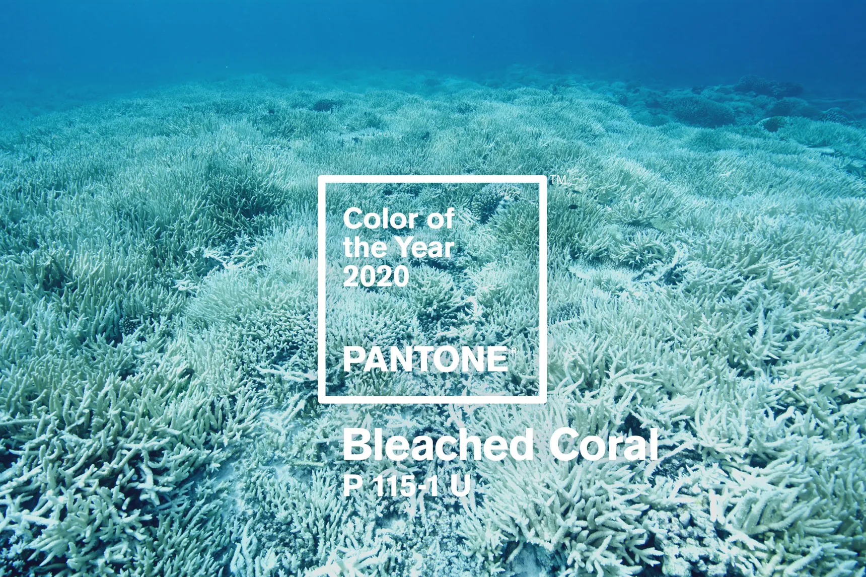
They argue that Pantone should use their clout and influence to bring awareness to this critical global problem.
Having personally interviewed leading marine scientists and written about how climate change affects coral reefs and on the importance of promoting sustainable practices to preserve reefs for the future, the contradiction hit home for me as well.
But, on the bright side, there seems to be no doubt that the discussion resulting from Pantone’s choice of Living Coral as Colour of the Year rose awareness, at some level, about the genuine problem of coral bleaching events.
As it’s still 2019, I’m certainly not done with Living Coral copywriting assignments. I’m glad to take a small part in keeping the conversation going.